One device, five brand directions
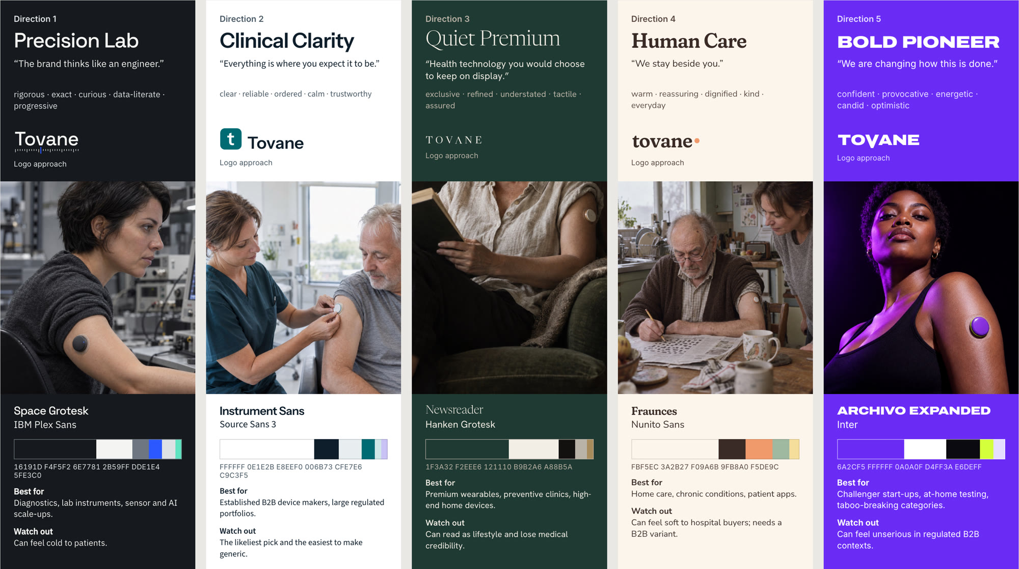
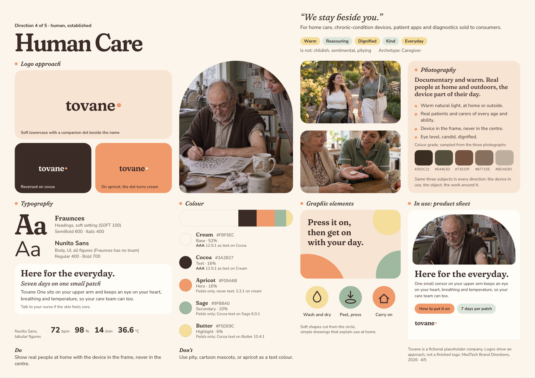
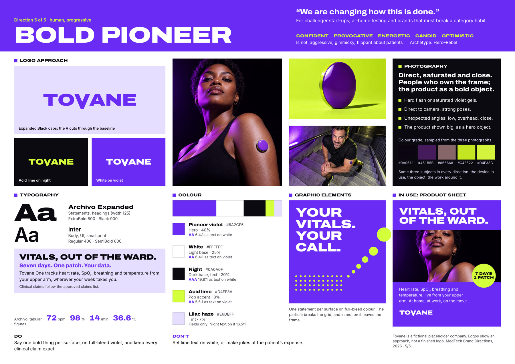
Before deciding how a brand should look and sound, you have to know who it’s talking to: consumers at home, a hospital or a research lab. I built five brand directions for one fictional MedTech company, each shaped for a different audience, so you can see the options side by side.
What strong MedTech brands have in common
I looked at 17 MedTech and HealthTech companies, from large device makers to young start-ups, to see what makes their brands clear and easy to recognise. Three patterns stood out.
People over devices
The strongest brands show the life the device makes possible.
The dot is the new cross
Medical symbols are getting quieter and more abstract.
A calm base, one hero colour
Neutrals carry the trust. One colour carries the personality.
Click through the five directions
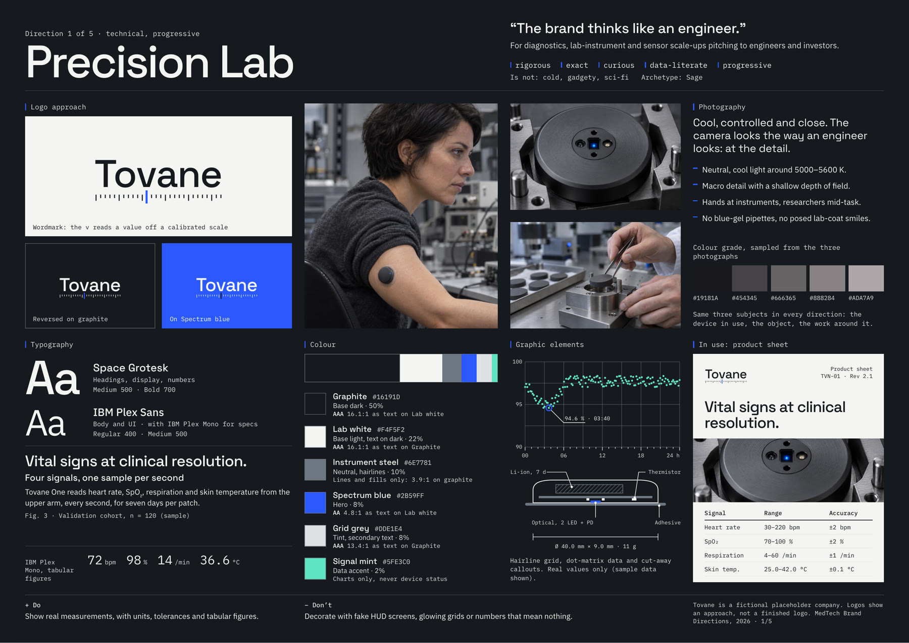
1 / 5 · Precision Lab
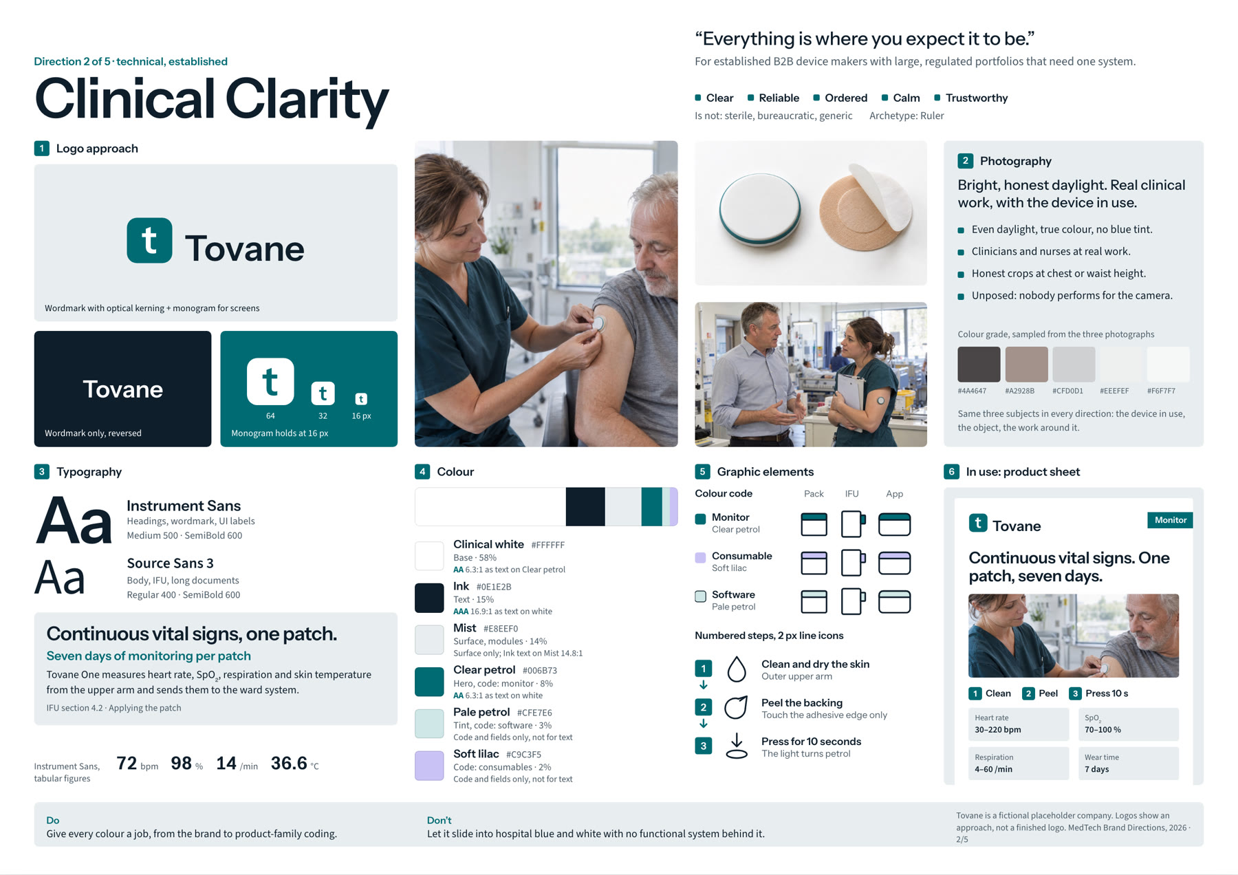
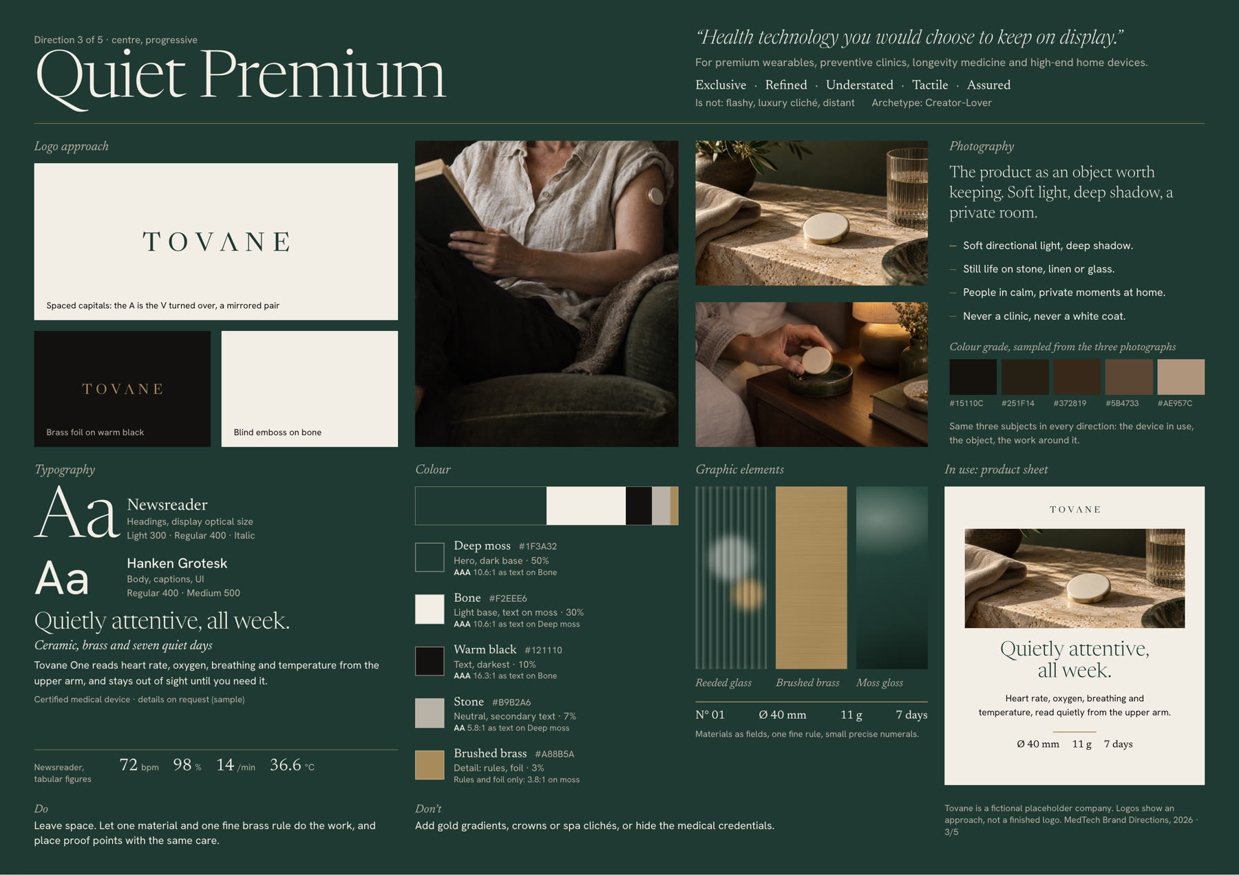
Start wherever suits you
It doesn’t have to be a big project. Some companies want a whole new identity, others need help with one piece. We can start somewhere and see where it goes.
Finding a direction
A few directions to react to, then two routes made for your company.
Sharpening what you have
Keep what works and make the rest more coherent.
One piece at a time
A presentation, a product sheet or a website, in a consistent style.
Templates and guidelines
Simple tools so your team can keep the brand consistent.